WNET is a flasghip PBS television station serving New York, New York and Newark, New Jersey. It began broadcasting in 1948 as WATV, and, after being reincarnated as WNTA-TV in 1958 and WNDT in 1962, became the current WNET in 1970, following a merger between the station and NET.
WNET is the parent company of THIRTEEN, which is the name that the station is branded under on-air.
Logos[]
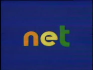
1st logo: On an ultramarine background, lines in formations of letters are swirling around in the center before settling to form "net". The "n" is orange, the "e" is yellow, and the "t" is green. All are in a futuristic font.
Variants[]
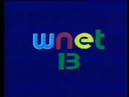
- In 1972, the logo was altered to read "wnet", with "w" in light blue and "n" in red; also, the letters swirl around an object which is revealed to be a teal "13" that moves downward.
- For its first year, the background and the letters are dark purple and white, respectively, and the animation is slower.
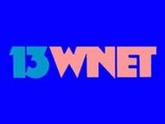
2nd logo: Just a In-credit logo with either "NET PRESENTS" (opening) or "A PRODUCTION OF NET EDUCATIONAL BROADCASTING CORPORATION (Copyright year)" (closing).3rd logo: On a blue background, we see a teal“13” to the left of a salmon-colored “WNET”, all in a very odd sans-serif font.
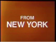
4th logo: On a black background, red rectangles with white horizontal pieces shoot away from the viewer,converging into a red screen with a white “FROM NEW YORK” on it. After a few seconds on screen, the pieces shoot towards the viewer, and “WNETPRESENTS” zooms forward.
Variant[]
A black and white version exists.
5th logo: A dull pink art deco-style "13" writes itself on a black screen, and it appears to be rotated so the "1" faces the bottom of the screen. The "13" zooms out as a red art deco-style "13" writes itself as a mirror image, overlapping with the "3" in the pink "13". Then a red "WNET" written in the same style appears at the bottom and zooms out. A pink "W" zooms in and out, followed by a red "N", a pink "E", and a red "T". Then the background turns red, and "WNET", in white and in a more normal-looking font, zooms in.
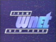
6th logo: Two white bars appear from opposite ends of the screen and slide horizontally to the center. After they collide, they retract to reveal "FROM WNET", with "NEW YORK" below. The whole text is in a stylized font. The white bars would do the same for the names of any company that funded the program which this precedes (e.g. "Corporation for Public Broadcasting", "Public Television Stations", "The Chubb Group of Insurance Companies", etc.). After the last text slide, the whole thing fades to black.
Variants[]
- The color of the background may either be black or blue. The latter is used for the filmed version and also onGreat Performances.
- On theGreat Performancesspin-offLive from Lincoln Center, the first slide after "FROM WNET NEW YORK" read "Great Performances", and the funding credits announcer also waited a few more seconds to start talking.
- Sometimes, this was superimposed.
- If there are no funding credits at the start of the program, this simply fades in and out.
- On the first season of Nature, one of the last programs to use this logo, the whole thing is set in the Modern No. 20 typeface.
7th logo: On a black screen, "WNET" appears as a yellow outline, in a more normal font than before. Below it is "NEW YORK" in the same font as before. Below all that is the logo at the time for their performing arts anthology seriesGreat Performances, depicting, from left to right, a ballerina, a stage actor, an opera singer, and an orchestra conductor standing atop a horizontal, rounded stage.
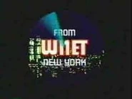
8th logo: On a black background, circular lines showing the New York skylines wipe in, with an outlined red “WNET” on it. The pre-2001 World Trade Center "Twin Towers" can also be seen, on the far left. As the “radar” circles two more times, the outlined “WNET” in red becomes more solid, and the morning sky becomes night. Finally, when the sky becomes completely dark, and “WNET” is filled in with white, “FROM” and “NEW YORK” can be seen above and below the letters respectively. The whole thing is in the same font as the previous logo.
Variant[]
A filmed version appeared on Heritage: Civilization and the Jews.
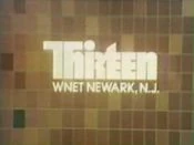
9th logo: On a greenish-gray background ,we see the words "ThiRtEEnWNET NEWARK, NJ" in white on a transparent rectangle protruding from the right. The "ThiRtEEn" is made up of some abstract, combined letter forms upper and lower-case all in it's corporate font and the other text is simply in Optima. Later, the bottom text fades to "Keeping what matters in sight" in a compressed white font aligned to the left.
10th logo: On a blue space background with dancing stars, “FROM” and “NEW YORK” zoom out, along with a "W", which then has an "n", an "E", and a "t" (all lowercase, sans "E" and in the same font the previous local logo was in) sliding out while the animation zooms out away from the viewer. “Sparks” then create parallelograms to surround “From” and “New York”, placed above and below the logo.
Variants[]
- An in-credit version appears at the end of 1986-1991 episodes ofAmerican Masters.
- In a rare exception to the general rule that station logos don't appear on co-productions between PBS stations, this and the KCET logo are played simultaneously, without any music, beforeTelevision.
- On some programs, including Shining Time Station, the logo is slightly sped up and the audio is out of proportion, or vice-versa.
11th logo: Tinted with the red color scheme from the Public TV For East Tennessee ident, we see various CGI/live-action-related clips (such as a train moving towards us, the window sill from the 6th PBS logo, a compass, a giant white/sea green "N" swinging in front of a running leopard, ect.) as the "ThiRtEEn" from the fifth logo zooms in very slowly towards us. As all this happens, a violet banner with "WNET NEWARK NJ" (which later changes to "NEW YORK NY") briefly appears below at the lower-right.
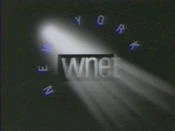
12th logo: On a black background, we see “wnet” in a thin font in a black rectangle with the letters carved out of it, and “NEW YORK” (in blue) appearing letter by letter, circling the logo counterclockwise while a spotlight shines around the logo, from right to left.
Variant[]
Sometimes, the logo is referred as "FROM wnet NEW YORK".
13th logo: TBA.
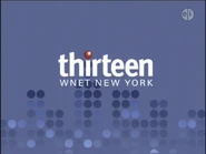
14th logo: On a dodger blue background with many flashing dots (apparently arranged to look like skyscrapers), a blue pulse “wipes” inside the words “thirteen” with a red dot on the "I" (placed on the background as to be placed on one of the "dotscrapers" as if an antenna), and the words “WNET NEW YORK” fade in below.
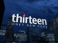
15th logo: We see an overhead view of New York City, with the "thirteen" from the previous logo, rendered in CGI, floating overhead. The camera pans down to a 20th Century Fox-esque angle (except it's reversed), so we see the logo from below.
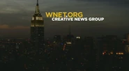
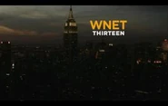
16th logo: We see the skyline of Manhattan at night. A yellow line draws itself next to the moon, and spins several times and stops by forming a lowercase "i". "TH" slides out of the left side of the "I" and "RTEEN" slides out of the right side of the "I". All of the text is in the Gotham typeface. When that's done, "WNET.ORG" in yellow appears above "THIRTEEN".
Variant[]
- OnWorldfocus, Firing Line with Margaret Hoover,andPBS Newshour Weekend, "CREATIVE NEWS GROUP" appears in place of "THIRTEEN".
- Since 2012, instead of "WNET.ORG", only "WNET" appears. As a result, the "i" animation is no longer used.
- Sometimes, as seen on episodes of Live from Lincoln Center, "THIRTEEN" doesn't appear at all.
- On WLIW-produced programs, such asFront and Center, "WLIW21" appears in place of "THIRTEEN".
Music/Sounds[]
1st logo: A four-note keyboard tune which is repeated four times, the last over a synthesized drone. Every year, the announcer says a different thing:
- 1970-1971: "The following program is a presentation of NET."
- 1971-1972: "The following program is from NET."
- 1972-1973: "The following program is from WNET/Thirteen."
Music/Sounds Variants[]
- For the logo's final year, the four-note keyboard tune is looped an additional time.
- Fanfare used the opening theme to the show, which is a synthesized score, and there is additionally no voiceover.
2nd logo: None.3rd logo: Possibly none.
4th logo: A synthesized, keyboard-driven rock tune. There are two arrangements: one slightly faster and more hokey-sounding, and the other cleaner and more professional.
5th logo: Same as the previous logo, except an announcer says either "Produced in New York by WNET" or "A Presentation of WNET".
6th logo: Technically none, except for the voiceover announcing the funding credits, and/or the opening theme of the program. However, if you listen closely, you might hear a test tone towards the end of this logo.
7th logo: A fancy 9-note synthesized brass fanfare.
8th logo: A 5-note synthesizer tune with chimes, repeating three times, just with different pitches.
9th logo: A relaxing 12-note piano tune with a few string and flute riffs thrown in.
10th logo: Same as the “Radar” logo.
11th logo: A pretty new-age tune with a piano, flutes and violins.
12th logo: A beatbox jingle with a choir sounder.
Music/Sound Variant[]
Sometimes, announcer Tom Stuart will say, "A production of WNET New York" over the jingle. This can be seen on American Masters.
13th logo: TBA.
14th logo: A 5-note digital piano sounder. However, you can also hear the closing theme of a particular show over this logo (likeCyberchase, for example).
15th logo: A held-out bass violin note, followed by a soft 5-note piano sounder with violas at the end. Sometimes it has the closing theme playing over it.
16th logo: A gracious 4-note orchestra tune. Sometimes extended.
Music/Sound Variant[]
A re-orchestration of the previous logo's music was used a few times.
Scare Factor[]
1st logo: Medium. This isn't very typical of an early '70s logo. The Scanimation and the synth drone in the latter half may get to a few.
2nd logo: None.3rd logo: None.
4th logo: Low to medium. The “pieces” shooting and the music may alarm some daydreaming viewers.
5th logo: Low, especially for those expecting the previous logo or the next.
6th logo: None. This is just a boring and rather unremarkable logo.
7th logo: Low; the fanfare may startle you, but this is an impressive lead-in to the then-new Great Performance sintro.
8th logo: None. It’s actually a favorite among closing logo fans.
9th logo: None.
10th logo: Low. The animation is pretty fast-paced, which may surprise some.
11th logo: None.
12th logo: Minimal to low, because of the somewhat strange music and darkness.
13th logo: TBA.
14th logo: None.
15th logo: None.
16th logo: None.
