Logos[]
1st logo (1968-1969): Just the stacked text from the final version of the previous logo, this time without the outline of Australia, appearing in the credits.
2nd logo (1969-1997): We see the Nine logo in the show's credits. The accompanying text and style of the logo changed over the years:
- 1969-1970: The words "National and "Network" above and below respectively in either a blocky futuristic font similar to the one used in the first Wide World of Sports intro used by the network or a curvy, psychedelic font.
- 1970-1975, 1981-1984: No text.
- 1975-1981: "Living Color", below the logo in the same style as the 1975 idents
- 1984-1986: The dots appear either side of the 9 numeral and the word "Stereovision" is below below. This was to promote Nine's commencement of transmission with stereo sound.
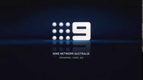
- 1987-1996: The logo is smaller and "Nine Network Australia" appears below.
Variants[]
- From the early 90s, the logo would sometimes be seen on a black-blue gradient background.
- On 1990s Sale of the Century episodes, after the Grundy logo has finished animating, it will zoom out and fade into one of the dots in the Nine logo as it zooms into place.
- Some programs would have a copyright notice accompanying the logo.
3rd logo (1996-1998): On a black background, we see a figure of nine dots together in a 3x3 cube, which slowly pans into full view. It becomes lit in the process and becomes gold with pink edge. The streaks draw a name below: "NINE NETWORK" with "AUSTRALIA" on second line, in a plain font.
4th logo (1998-2001): On a black background, we see nine dots together in a 3x3 cube which rotate and face us. Next to it is the number nine in orange which is also formed by rotating. Underneath we see the words "NINE NETWORK Australia" in a font similar to the ident they had at the time, which started out stretched by coming together to become normal. In the middle of the screen is the URL ninemsn.com.au which fades in below. This is the joint website for Channel Nine and MSN Australia.
Variants[]
- In 1999 the logo was enhanced to represent the new on-screen IDs. The Nine logo is now in gold.
- Also in 1999, a variant was used after a broadcast of a Bee Gees concert. The nine balls are now disco balls and zoom out from the screen with the number nine already there. When the text transitions in, the disco balls return to normal. The URL is not present.
- A UFO-themed variant exists.
5th logo (2001-2003): On a black background, we see lots of dots expanding and contracting. Nine dots appear rapidly one by one, followed by the number 9. At the same time the words "Nine Network Australia" as well as the NineMSN URL fade in below.
6th logo (2002-2006): We start in the middle of a CGI Channel Nine logo and zoom backwards and turn right onto a blue gradient background. The text from the previous logo are there but now with a copyright year stamp.
Variants[]
- Once again, the URL is sometimes changed to provide a specific web address for a show.
- Late in the logo's life the name was referred to as "Nine Films & Television".
7th logo (2006-2007): A blue gradient square with the number 9 is seen on a black background. The name is below the square, together with copyright info and website, all in three lines. The square shines.
8th logo (2006-2007): A blue square with the number 9 is seen on a black background. The name is below the square, together with copyright info and website, all in three lines. The square shines.
9th logo (2007-2008): A blue square with the number 9 appears followed by orange square and a gray background in quick succession. A black bar appears below with the the NineMSN URL. Next to the number nine are the words "NINE NETWORK" which fade in. The words "PROUDLY AUSTRALIAN" fade in underneath at the same time. White squares appear randomly.
Variants[]
- There was a version which was superimposed on such shows as A Current Affair, Who Wants To Be A Millionaire? and Australia's Funniest Home Videos. The grey background was replaced by the continuation of the closing shot of the show. The rest of the logo remained unchanged.
- As with the previous logo's, the URL was modified to provide a more specific web address to a particular show.
10th logo (2008-2009): The background is a blue sunny sky with very few clouds and clear dots in the sky. We see nine dots flying in the sky which come together to form the familiar nine dots of the Channel Nine logo. The number nine appears from behind the dots. Text below is already formed. On the top, the words "Proudly Australian" are used followed by the company name "NINE NETWORK AUSTRALIA" and on the bottom is the NineMSN URL.
Variants[]
- Sometimes a copyright stamp is used.
- There is a superimposed version of this logo used on shows such as A Current Affair and Australia's Funniest Home Videos.
11th logo (2009): We see nine differently colored dots which form the iconic nine dots logo. A white vertical line grows and then produces the number nine on the left side and text on the right side. The text is in exactly the same arrangement as the previous logo. All of the logo happens on a lime green background. This is directly based on the IDs at the time.
Variants[]
- This logo sometimes appeared on a black gradient background.
- As before, there was a superimposed variation of this logo.
12th logo (2009-2012): On a blue and white, space-age background, we see blue mist appear on the screen. It reveals to be the Channel Nine logo. On most occasions text faded in on the bottom of the screen which has the Proudly Australian byline as well as a copyright stamp. This directly reflected the current Channel Nine IDs.
Variants[]
- There is a version that is seen on some shows such as the Australian version of Pyramid that omit the text.
- There is a superimposed version of this logo.
- As the annual Credit Union Christmas Pageant was produced by Channel Nine's Adelaide unit. The text is changed to say "PROUDLY SOUTH AUSTRALIAN" (as this is the Australian state that Adelaide is located). Underneath is the copyright stamp which reads "(C) (Year) WIN and SA Tourism Commission". On the bottom of the copyright stamp is the byline "a division of WIN Corporation" (as the Nine stations in Adelaide and Perth are owned by Nine affiliate WIN Television).
13th logo (2012-2015): On a background (color variations listed below) we see, all at once, the Channel Nine logo being filled with color, a streak zooms in the bottom left corner and the phrase and copyright stamp from the previous logo fade in. All heavily based on the 2012 ident package.
Variants[]
The actual production logo has only been spotted on one show and hence in one color, but in-credit logos and Channel Nine's own idents have these colour variations.
- Green
- Blue
- Purple
- Yellow
- Red
14th logo (2015-2020): On the show's ending background, the watermark fills with a certain color (the dots fly in, but not on WIN television as the dots aren't in the logo) as a rectangle, which has a darker version of he same color as the logo, with a ribbon in it (like the 2012 branding) appears. Inside the rectangle, we see "NINE NETWORK PRODUCTION" in white. Above it is another rectangle, in the same color as the logo, reading "PROUDLY AUSTRALIAN". A copyright stamp is seen below, in another rectangle.
15th logo (2020-): Over either the final shots of the program or a custom end card for the show, the 9 dots fly into place, while the numeral 9 wipes in from top to bottom in the appropriate color for the program (e.g. yellow for Today, red for A Current Affair and 60 Minutes, etc.) with the worlds "A Nine Production" at the bottom in the network's standard font. Below that a copyright notice appears in the same color as the 9 logo.
Music/Sounds[]
1st logo: The end theme of the show.
2nd logo: Just the credits of the show.
3rd logo: A 3-note electronic tune.
4th logo: Same as before.
Music/Sounds Variant[]
On the disco version we hear whooshing sounds when the disco balls fly past us. On the Australian version of Who Wants to Be a Millionaire, the "think" cue used for the $2,000 question is heard (though the Grundy logo before that uses its own music).
5th logo: Sci-fi sounds for the dots appearing (which are the same sounds heard during the Channel Nine idents), then a space-age rendition of the long-running slogan "Still The One" (which are three notes descending in tune).
6th logo: A whooshing sound accompanied by a fast descending note tune on a bright piano. This is followed by a news-style remix of the three note "Still The One" theme.
7th logo: A wiggling electronic soundtrack different from previous logos.
8th logo: A wiggling electronic soundtrack different from previous logos.
9th logo: A shortened version of their generic music which sounds electronic. Beeping sounds accompany the white squares when they appear on screen.
10th logo: James McColl singing "You better smile..." (adapted from the 1997 song "Smile" by the band McColl fronts, The Supernaturals; said song was used in Nine Network's 2008 "We Heart TV" campaign, with rewritten lyrics), followed by a female voiceover saying "Channel Nine" (this woman's voice was featured in promos for many Channel Nine shows).
11th logo: A calming 2-note guitar riff based on the music of the idents at the time.
12th logo: A electronic, space-age six note tune (similar to the 2006 logo).
13th logo: Only the closing music of the program.
14th logo: The closing music of the program.
15th logo: Just the end theme of the show.
Scare Factor[]
1st logo: None to low.
2nd logo:
3rd logo: Low.
4th logo: Minimal with the logo's music, none with the TV shows closing theme.
5th logo: Low. The music and the black background could scare a few, but this logo is based on one of Channel Nine's most favourited idents.
6th logo: None to minimal, bordering on low, mostly because of the zooming and music. Again, this is a well favourited logo by many.
7th logo: Low; some may be bothered byu the music.
8th logo: None.
9th logo: None, this logo is just boring. Even the previous one is better.
10th logo: None to low.
11th logo: None.
12th logo: None to minimal.
13th logo: None.
14th logo: Minimal. You may be surprised if you expected previous logo, but it's harmless.
15th logo: None.
Video[]
Nine - Production end board (2002)