3rd Logo (Late 1970's)
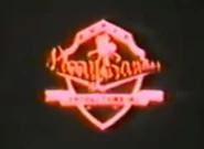
Logo: We see the shield from before, but instead of yellow and green it's red all over it's details and the camera now it's black. The white of the shield it's light-red, along with the text, which is more darker, but not the red we expected, all set on an extremely black background. It zooms out very slowly mainly beacuse it's far away from the screen and then it cuts to the opening theme of the movie.Nicknames: "The Larry Santiago's Shield's Dark Side" "The Zooming Shield Of Doom", "V of Doom's Filipino Twin", "The Creepy Red Shield", "The Reason Why I Didn't Watch Mga Ani Ni Angelita" "If The Sudden Cut-Off Prevention Was The Movie Itself" "Lucifer's Shield" "The Barely Seen Shield" "Looney Tunes Without The Looney Tunes" "Merrie Melodies Without Any Single Melody" "What Were They Thinking? IV: The Larry Santiago Shield" "Everyone's Own Tiny Eyesore" '4th Place For The Worst Logo Ever'
FX/SFX: Just the zoom-in.
Cheesy Factor: Far off the charts, notice beacuse the shield is hard to see and it jarringly cuts to the opening movie. A black background doesn't help either. However, the cheesiness comes from the red scheme of the shield.Also the text is hard to read.
Music/Sounds: Generally none, which adds to the scare factor.
Availability: Ultra-rare, You can find this on Mga Ani ni Angelita and other movies from the time.
Scare Factor: High to nightmare. Just the fact that it zooms it far away from us and jarringly cuts to the opening theme of the movie can bother some and then shiver their bones. This, combined with the darkness and the lack of music, which has no reason of all, makes this no doubt one of the scariest logos ever made. However, it's Medium for those who used to it, as the nature of the logo is still frightsome.

