Logos[]
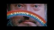
1st logo (1995; 2001): We see a psychotic-looking man with a fixated stare on his face (actually legendary film director Orson Welles). He holds a small yellow box in his left hand and a small cardboard rainbow in his right hand, which he pulls completely out of the box, as the camera zooms in. When the camera gets close enough, it freezes, and the words "A RAINBOW RELEASE" (in white) slowly appear letter-by-letter in an arc.
Variant[]
On the 2001 film Festival in Cannes, the logo is cropped a bit, and "A Rainbow Releasing" is replaced by "A Rainbow Picture". Also the text has finally been put in a fixed position (it fits the rainbow), and it doesn't remain on-screen like the previous logo.
2nd logo (2014-): TBA
Music/Sounds[]
1st logo: None.
2nd logo: TBA
Scare Factor[]
1st logo: Low. The silence can creep some out, but this is a cool logo.
2nd logo: Minimal, the flash and cymbals might catch someone off guard.
Trivia[]
The first logo was actually sourced from a film called A Safe Place, starring Orson Welles and directed by Henry Jaglom, who is also the owner of this studio. Also, you can see the scene in the trailer of it, which you can find it here.


