Logos[]
1st logo: It's basically the same as the 1985 Walt Disney Television and Buena Vista International Television logos, except the text below fades to "Distributed By Buena Vista Television".
Variants[]
- On shows produced by Buena Vista, only the "Buena Vista Television" text is shown. The spark goes from left to right in this variant.
- International releases of shows would say "Distributed by Buena Vista International, Inc." instead of "Distributed By Buena Vista Television".
- There is also a chyroned in copyright date that appears underneath the logo.
- A variant of the "standalone" logo has the text set horizontally rather than vertically.
- One variant had a dark purple background instead of the indigo-blue background. This variant can be found on the VHS of Winnie the Pooh: Detective Tigger.
2nd logo: It's only the same as the 1990 Walt Disney Television logo, except the text below fades to "Distributed by Buena Vista Television".
Variants[]
- Network TV Variant: See the 1st logo.
- There is a longer version of this logo. The BVTV text flies up from the bottom of the screen with a chyron trail (like the Telepictures "Rollercoaster" logo), then zooms out from inside the castle and centers itself under the castle. The normal animation then plays.
- There can also be a copyright date under the BVTV text. This could usually be seen on Bill Nye the Science Guy.
- Reprints of Witt/Thomas/Harris-Touchstone shows, such as early '90s syndicated reruns of The Golden Girls, had this logo with a "Touchstone Pictures and Television" copyright stamp, plastering the original Touchstone TV logo.
- Sometimes, this logo is completely still.
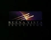
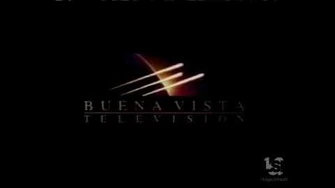
3rd logo: It's only the same as the 1991 Walt Disney Television logo, except after a few seconds it changes to "Distributed By Buena Vista Television".
4th logo:
We start at the angle of a dark blue Earth globe on a black space background filled with stars (possibly the Milky Way) which can be seen within a borderless background boxed-in against a black background. Three comets can be seen streaking past the globe in an diagonal direction from the bottom left corner toward the upper right corner, and gradually zoom away into the black background. The comets fly past the globe, burning dark blade-cut imprints in the process throughout the entire box, as the following text:
B U E N A V I S T A
T E L E V I S I O N is wiped in from left to right by way of a fancy gradual dissolve. The comet blade imprint is light-colored from inside the globe portion and dark-colored from outside the globe. As the comets fly past the globe, the space background fades from a black color to a gradient yellow-purple color that can be more visibly defined from the background, with a yellow dot that appears to be the sun appearing on the surface of the globe. The gradient color also appears within the "BUENA VISTA TELEVISION" text.
Variants[]
- Like the last logo, it would sometimes have copyright info underneath.
- Like with the previous logo, reprints of Witt/Thomas/Harris-Touchstone shows, such as Lifetime's airings of Nurses, had this logo with a "Touchstone Pictures and Television" copyright stamp, plastering the original Touchstone TV logo.
- On the demo reel of Pittard Sullivan's creations, a brief clip of this logo starts at the point where the three comets fly around the rotating globe when gradually zooming away like the medium version of the 1997 logo. Although the extended music exists, this was going to have the long version (like the 1997 and 2005 logos) which were used, but instead it was scrapped and never used.
5th logo: We start at a closer overhead view purple Earth globegradually rotating and zooming away. A rectangular box fades in and creates an enclosure around the globe and space background with the surrounding area fading to black. The comets fly past the globe and while it trails off, they leave a frozen motion mark behind just barely past the border of the globe and in the center of the logo (the middle comet is the shortest, the top comet is longer, and the bottom comet is the furthest out) as the following text:
B U E N A V I S T A
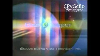
T E L E V I S I O N is faded in from left to right by way of a fancy gradual dissolve. 6th logo: The same concept as before, except that the planet "Neptune" is in place of the Earth globe on a spiffier version of the Milky Way, and we start from a different position than last time. On a black space background, we see three comets. We pan up to the Neptune and pan to its upper right, where the comets fly to the back. Three comets streak from the left and freeze, and the screen turns white with the logo of the comets and globe in space in a box at the top, and the "BUENA VISTA TELEVISION" text, in gray, fades in and zooms out to take its place under the logo.
Variants[]
- A more common short version starts with the last three comets streaking past first appeared in 2005, while the longer variant appeared in 2006.
- There is a rare variation that is longer than the short version, yet shorter than the extended version, where the logo starts when the comets pass the Neptune instead of circling around it.
- A stretched version of the 4:3 logo exists. That was used for the French dub of Stephen King's Desperation.
Music/Sounds[]
1st logo: Same as the Walt Disney Television logo themes both from 1985, the closing theme of the show, or none.
2nd logo: Bell music, but in most cases, it's silent or the finishing of the end title theme from any show plays over the logo. But on reruns of Bill Nye the Science Guy from this era that were reran after the 4th logo debuted, the music from that logo was used.
3rd logo: None.
4th logo: A 7-note horn fanfare, which sounds almost like a "space-age" remix of fanfares that were used to close out old Mickey Mouse cartoons.
Music/Sound Variant[]
- Usually, the music was played at warp-speed.
- The closing theme of the show was sometimes used.
- Original airings of Disney's Scott Hamilton Upside Down had the generic CBS theme.
- Quack Pack VHS releases have the 1990 Buena Vista Home Video theme play over this logo.
- On the season 4 Bill Nye the Science Guy episode "Volcanoes", Bill screams into the logo while a explosion sound is heard with the logo's standard music.
- Some episodes of Bill Nye the Science Guy play the theme for the long version on the standard logo and the other half in the BVTV international logo.
5th logo: Same as above, but this time never at warp-speed.
Music/Sound Variants[]
- An extended variant of the music has some chimes before the horns come in.
- In some cases, the last note is incomplete.
- A medium-length version was sometimes used,which takes the first note of the long version then goes straight to the fourth note, and it is redone as the chimes have a short delay before each chimes (unlike the flourish chime in the long version), the fourth and fifth notes are shortened, and the flourish does not play until the last two final horns play.
- On the Bill Nye the Science Guy episode "Comets and Meteors", the flame breath sound effects are played during the jingle of the entire logo while footage of the previous logo and the BVTV International logo are in use.
- On Bill Nye the Science Guy, one half of the short music plays through the standard logo, the other half plays over the BVTV International logo. On a couple of episodes, this occurred with the long version of the music.
- In Winnie the Pooh: Three Cheers for Eeyore and Rabbit, the dinging noise that is heard at the beginning of the long version is absent.
- On a 2006 AMC airing of When a Man Loves a Woman, a low-toned version was used.
- During Lifetime airings of The Golden Girls, the logo's music would sometimes by slightly off-sync.
- Sometimes, it just used the closing theme of the show.
- Original airings of Who Wants To Be a Millionaire used a generic ABC theme.
6th logo: A re-orchestrated version of the fanfare in the 1997 logo. Again, there were long, short and medium-length versions.
Music/Sounds Variant[]
On The Tony Danza Show, it used the 1997 logo theme.
Scare Factor[]
1st logo: Same as the 1985 Walt Disney Television logo.
2nd logo: Same as the 1990 Walt Disney Television logo. People who have fond memories of watching shows such as Bill Nye on PBS will hold this logo in high regard.
3rd logo: Same as the 1991 Walt Disney Television logo.
4th logo: Low. The combination of the autonomy of this Buena Vista logo (as opposed to previous logos, which clearly identified it with Disney) along with the dark tone and the burning streaks may put off a few viewers. The warp-speed fanfare may also startle some people used to the normal fanfare from the later logos. The Bill Nye season 4 variant is minimal as it's really funny.
5th logo: Low, especially for the long and medium versions, which may be off-putting to some for its dramatic build-up.
6th logo: None. It's a nice logo.
Video[]
Buena Vista Television (1997)

Celador Valleycrest Buena Vista Television (2001)

Buena Vista Television (1986 2002)
Buena Vista Television (2006)